


10 Push Notification CTA Buttons That Drive Clicks
CTA buttons are one of the key elements to increase customer engagement and drive conversions. Get inspired by these 10 best practices.
Wednesday, Jul 3, 2024 / Push notifications
CTA buttons are one of the key elements that have made push notifications so successful in increasing customer engagement and driving conversions.
These buttons simplify user interaction and provide direct, clear paths to desired actions, making push notifications by now an integral part of any business’s customer communication strategy.
In this blog, we will:
- Deep-dive into the topic of call-to-action buttons (what they are, how many can you insert, and the close button regulations)
- Explore how & why they became prime elements in any sales, marketing, or customer retention game (benefits, analytics, and if every push should even have CTA buttons) and
- We will give you 10 best practices with examples of how to use CTA buttons in push to achieve desired results.
What is CTA in Push Notifications?
CTA buttons in Push notifications are a directive, interactive element within the notification that encourages users to take a specific action, like “Shop Now” or “Learn More,” typically leading them to open the app or visit a website from which the message originated to complete the action.
Consequently, from a technical point of view, CTA buttons contain a landing page URL leading users to where they should take their next action.
Example of push notification CTA buttons on Android
CTA buttons vs. Action button
While CTA is a term that is sometimes used interchangeably with action buttons when speaking of push notifications, there are differences that set them apart, such as technical aspects and intended purposes.
As mentioned above, CTA buttons in push lead users to open the app or visit a website with a URL to complete a specific action, while action buttons in a push allow users to perform specific actions directly from the notification.
Consequently, from a technical perspective, action buttons don’t contain a URL, while CTAs do.
The intended purpose of an action button is to drive immediate engagement, while the goal of a call-to-action button extends beyond immediate interaction, often encouraging users to take further actions.
How many CTA buttons can you put in a push notification?
The number of action buttons in a push varies from the device / push source (if the notification came from an app, desktop web browser, mobile web browser, etc.), operating system (iOS or Android, Mac or Windows), and your push notifications service provider.
Hood, as a push notifications service provider, allows you to implement 3 CTAs for Android app push and web push and 2 CTAs across all other device sources and operating systems.
However, as mentioned above, this is not the only factor in how many buttons will be shown to your user.
Here’s an overview of how different push buttons behave on different operating systems and browsers.
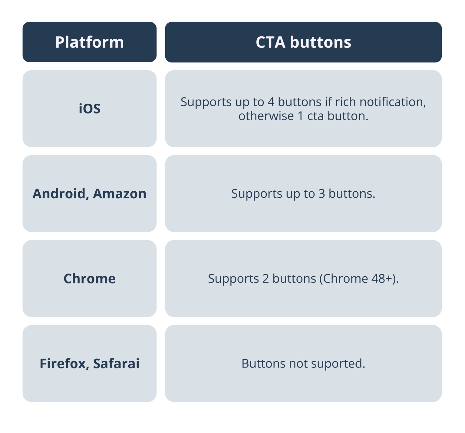
Number of CTA buttons in push notifications according to different operating systems & browsers
Regardless of their number, it is important to recognize the impact of well-designed and thoughtfully implemented buttons, as they can significantly influence users to achieve the desired outcome.
The Close button regulations
The Close button plays an important role in consistent user experience, ensuring notifications are actionable and remain visible until addressed by the user.
Here’s how they’re regulated according to devices and operating systems.
Windows 10 & later
By default, web push notifications include a Close button. However, if you add any other buttons of your own, the Close button is automatically removed.
MacOS
MacOS push notifications that have the “require interaction” flag enabled will remain on-screen until the user interacts with them.
Notifications can include buttons that become visible, however, only when the notification is expanded.
The Close button on MacOS behaves similarly to how it does on Windows - if push call-to-action buttons are present, the notifications will remain on-screen until the user interacts with them.
iOS
IOS supports up to 4 CTA buttons for rich notifications. If you’re not sending a rich notification, then it supports only 1 CTA. When these buttons are present, the notification remains interactive and doesn’t include an explicit Close button.
Android
Android supports up to 3 CTA buttons. When the buttons are present, the notification remains active without a Close button, requiring user interaction for dismissal.
Benefits of Push Notification Buttons
In the early days of mobile operating systems, such as the initial versions of iOS and Android, there used to be only a single action available when receiving a push notification: tapping on it.
However, as the consumer needs evolved, so did push notification services, “forced” to make user engagement a two-way street.
That’s how different types of push notification buttons came to be.
To start with, push buttons simplified the communication between businesses and their users by reducing the amount of time needed to take action. They provided push recipients with clear paths to the desired outcome and, in the case of action buttons, allowed them to interact directly from their lock screen.
Action buttons also made it possible to save content for later or snooze a given notification right from the notification center. This option allows users to further customize their experience and engage with your message when the time is right for them.
Aside from increased engagement, push buttons give you significant insights into user preferences and behaviors. This feedback is invaluable for shaping your user base, planning future push campaigns based on user interactions and analytics, and much more.
Push notification CTA buttons analytics
Hood’s Reports designer provides valuable insights into your users’ behavior and preferences regarding CTA buttons in push notifications.
Its simple drag&drop design allows you to gain insights with just a few clicks, letting you see how your users actually interacted with your push and what buttons they preferred.
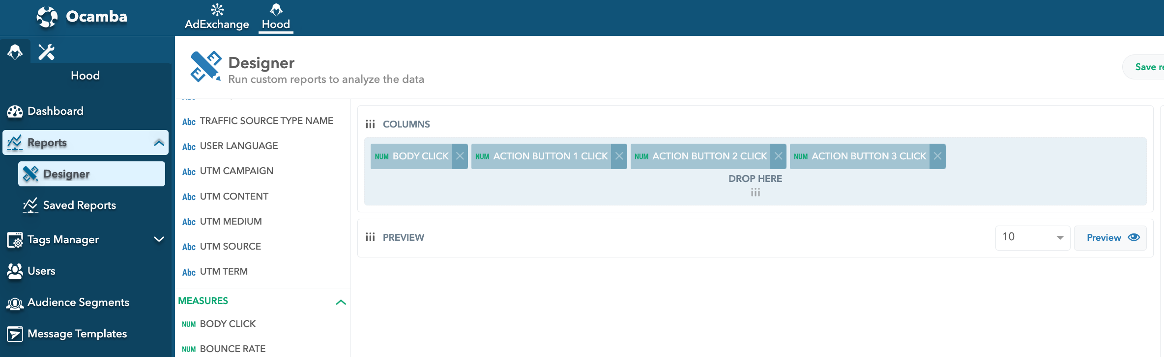
Push notification CTA buttons analytics in Hood
Should Every Push Notification Have Buttons?
The answer to this question is pretty individual - it depends on your push notification strategy and what you wish to achieve with it.
However, we would say, in general, no, not every push should necessarily have buttons.
It is better to save them for the time when you “really need them”, that is, when you wish your users to perform unique actions that cannot be completed simply by tapping on the notification. Otherwise, you risk causing notifications fatigue.
For example, when delivering general news or updates that don’t require (immediate) action, it’s better to keep the notification simple, or the practice of including the “No, thanks” button is not always a good choice, as the users can already dismiss or ignore the notification on their own.
Simply put, using buttons only when necessary, you will increase the likelihood of user interaction when such interaction is highly desirable.
10 Push Notification CTA Button Strategies That Make Users Want to Click
The first rule to encourage users to click is designing action buttons that are clear, compelling, and relevant to the notification content.
The second rule is to limit the number of action buttons to avoid users feeling overwhelmed and simply ignore the notification.
And, to get you inspired, we’ve compiled a list of 10 push notification CTA button strategies that could help you out find the best practices for your push notification campaign strategy.
1. Create a sense of urgency
Use words such as today, final hours, last chance, and now to make users feel that unless they act immediately, they will miss out on a valuable opportunity.
CTA buttons examples
- Buy Now
- Claim Offer Today
- Secure Your Spot
- Shop Final Hours
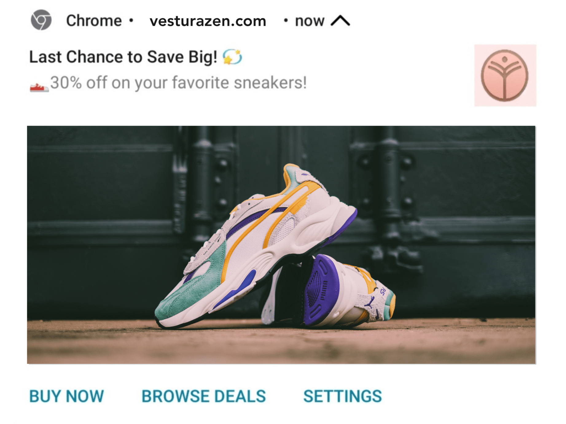
Example of push notification CTA buttons to create a sense of urgency
2. Use actionable words
Similar to the previous example, actionable words, such as grab, act, claim, secure, bring excitement and motivate users to take immediate action.
CTA buttons examples
- Grab Yours Now
- Claim Offer Today
- Secure Your Deal
Example of how to use actionalble words in push notification CTA buttons
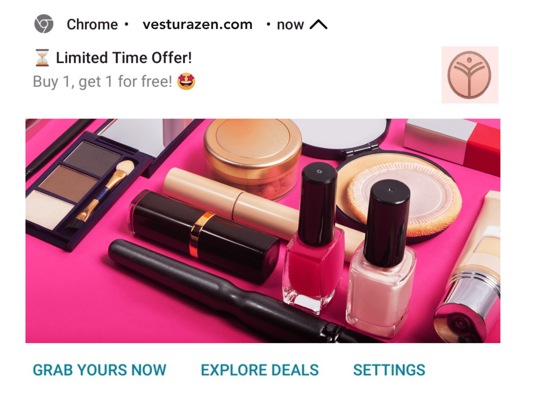
3. Feature no-cost benefits (if any)
If you’re giving out something for free, a service that you’re providing has a complimentary element, or there’s a bonus to a purchase, make sure you emphasize it in your CTAs, too.
Words like free, complimentary, no cost, etc. are very attractive and definitely encourage people to click.
CTA Button Examples:
- Get Free Access
- Claim Bonus
- Download Gift
- Try It Free
- Bonus Item
- On the House
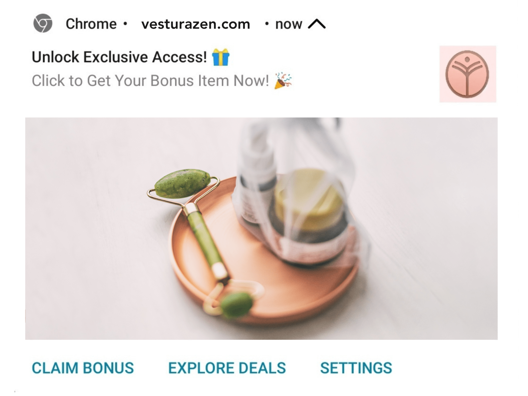
Example of how to feature no-cost benefits in push notification CTA buttons
4. Highlight what they’re gaining
Benefit-based CTA buttons are highly effective because they directly communicate the advantage the user will gain, making the offer more appealing.
CTA buttons examples
- Save Money
- Earn Rewards
- Get Loyalty points
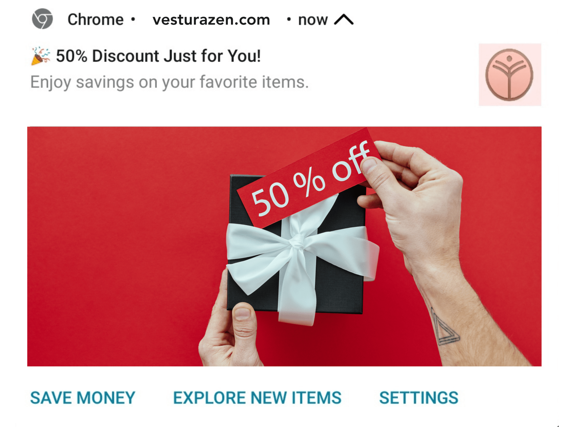
Example of how to highlight what they're gaining in push notification CTA buttons
5. Remind & offer rescheduling
For companies whose business includes some form of appointment (restaurants, rental companies, delivery companies, etc.), canceled appointments and no-shows can cost big money.
CTA buttons offer a solution to easily confirm or reschedule appointments, while reminding users of their scheduled appointments.
CTA Button Examples:
- Confirm Appointment
- Reschedule Now
- View Policy
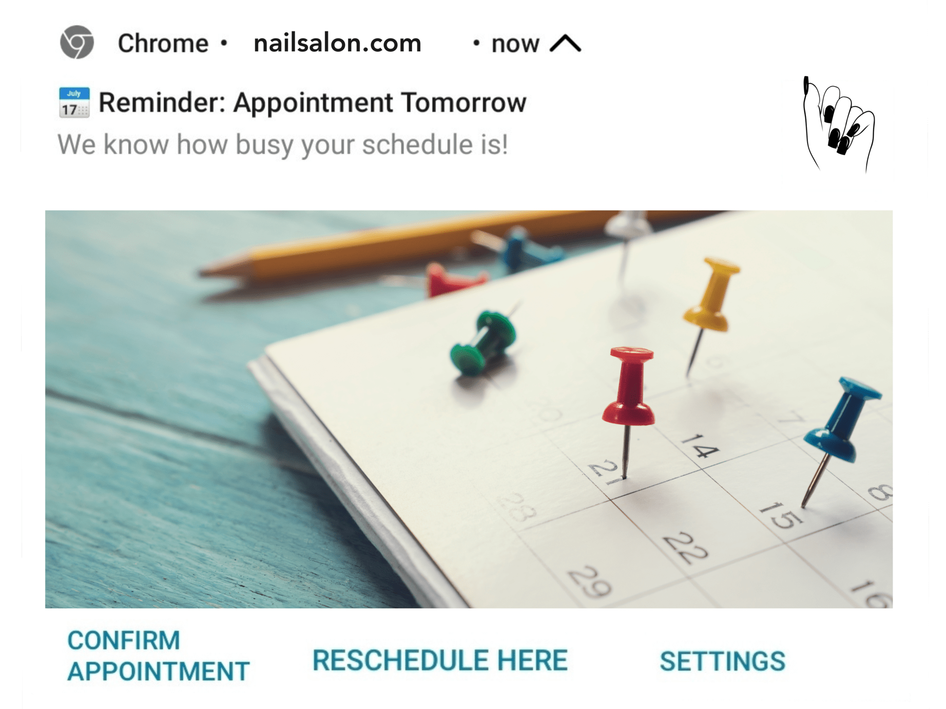
Example of how to remind users & offer rescheduling in push notification CTA buttons
6. Explore your users’ preferences
You can explore your users’ preferences by offering something you think they might like, and at the same time provide other options to explore alternatives for future references.
This strategy can be for content engagement and brand awareness and for positioning yourself and your company as industry thought leaders.
CTA button examples
- Read Now
- Explore Similar Topics
- Explore Blog

Example of how to explore your users' preferences in push notification CTA buttons
7. Social proof as a CTA in push
One effective approach to motivate users to explore your offers is to highlight specific items from new collections that are trending or have received social proof, such as featured in industry-relevant magazines, loved by influencers, or have received positive customer reviews.
CTA button examples
- Influencer Faves
- Customer Faves
- Top-Rated
- What’s Popular
- Trending Now
- Hot Picks

Example of how to highlight social proof in push notification CTA buttons
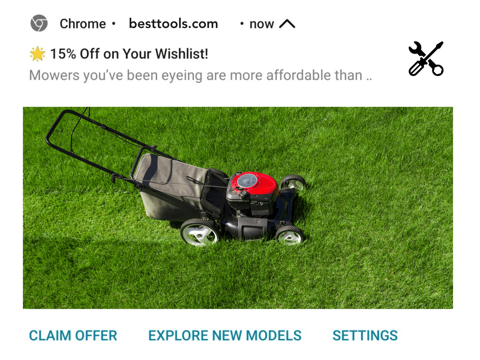
8. Personalize when possible
Tailor the action buttons to the individual user preferences or past behavior to increase relevance. You can do this by leveraging tools, such as Hood, that offer detailed user behavior analytics with 100+ measurements and dimensions.
For example, if the user browsed garden tools, and you are sending them a push notification on something they’ve viewed before, such as a lawn mower, you might want to offer them to check out the new collection of lawn mowers or some other related garden tools.
CTA buttons example
- New Models
- Explore Garden Tools
- Check Latest Deals
- Discover More Tools
Example of how to personalize push notification CTA buttons
9. Give them a sneak peek of your product
If a preview of your product is available, offering a sneak peek via a CTA is a great way to convince them to buy or subscribe.
CTA Button Examples:
- Preview Issue
- Take a Sneak Peek
- See Inside
- Get a Glimpse
- Preview Now

Example of how to give a teaser in push notification CTA buttons
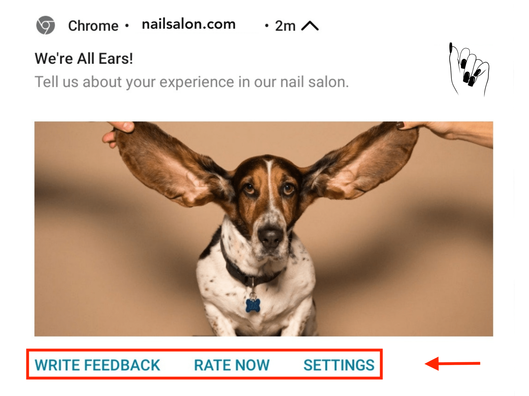
10. Give your users a few choices
Give your users a few CTAs, where the first one is what you actually want, and the second one is similar but less demanding. This approach can increase engagement by providing options that cater to different levels of user willingness and time availability.
For example, writing a review can be demanding, and not everyone will have the time or inclination to do it. However, more people might be willing to rate your service, which is also valuable.
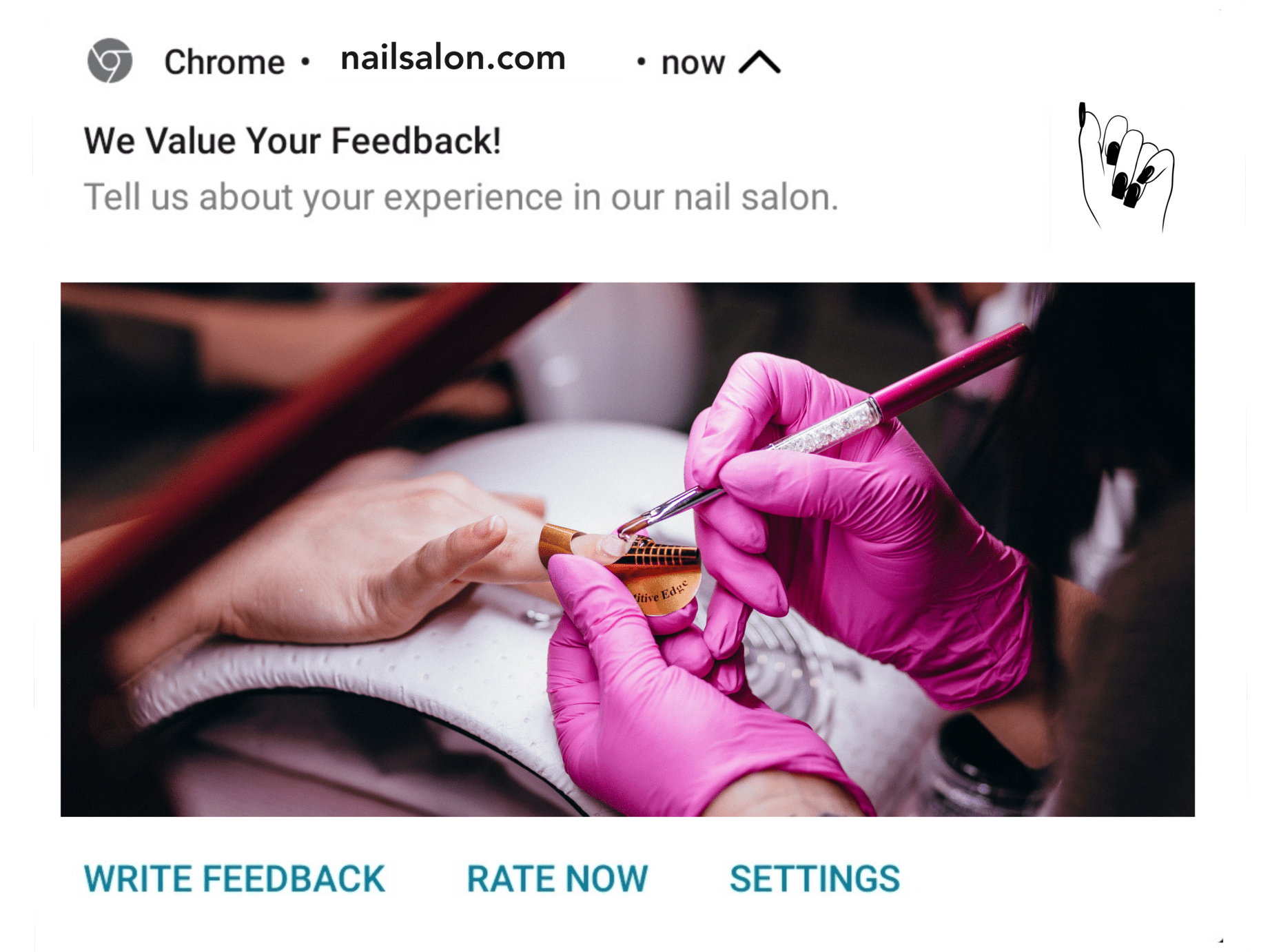
Example of how to give users a few similar choices in push notification CTA buttons to make them click
Leverage Technology To Drive Conversions
Now that you’ve learned how to craft push notification CTAs that are clear, compelling, and relevant, it’s time to choose a technology that will help you optimize this process, and save you lots of time and money.
Sign up for our live, 1-on-1 demo, and don’t miss this opportunity to see how Ocamba can transform your approach to push notifications and CTA optimization.
Elevate your business, increase customer engagement, and drive conversions with our cutting-edge solutions. Today.
About
Combining advanced technologies and a hard-working team with over 15 years of experience in the field, we give our customer's multiple possibilities to increase revenue, minimize fraud and encounter both the demand and supply side of the process through our smart RTB system.


 www.ocamba.com
Copyright © Del Systems
×![]()